
I decided to make this post because there’s not enough on the topic. All I found last time I checked was someone saying it should to die and I hated that article. So here’s mine:
This is so cool. I separate my colours in channels in any version of Photoshop, which I can near perfectly simulate what colours do in screen-printing based on my real life experience of those inks. Once I’ve fine-tuned the blends I can either create dot-tones or if the printer has a RIP-software, like pretty much most serious screen printing shops will have, I can delete my RGB/CMYK channels, leaving only my Spot channels to be Saved As a Photoshop DCS (.eps) file. (Again doing dot tones is doable by hand, and there’s tons of blogs on this already.)
Then as long as this file is in the same folder as my print file, I can use the File<Place option and select the DCS to embed it in an Illustrator file, then put your registrations & whatever you like. Then you can print it as if it were vector colors by going to File<Print<Output<Mode: Separations and select each individual channel (if need be) for print to your film.
There is currently no other file format that works this efficiently for complex colour separations in screen printing. At any point, say the white needs to be trapped more. No worries about selecting all the vectors or nothing, just go into PS, select, contract a few pixels and knock em out, then hit save. The DCS automatically updates in Illustrator, it will ask you and you just say OK. Done. Re-print your film with no guesswork. Take that, vector-sep-guy.
It’s also THE ONLY way to handle complex photo-blends as well as fine-line work. If you get to a certain number of objects(or dots) in vector than you can start taking coffee breaks in between mouse clicks it bogs the CPU so much.
I must also mention how quick and easy all sepping is in channels once you know how to do it. If you are interested in the wild world of photo-smooth t-shirt sep’s I highly recommend you learn it from the master who taught me, Mitch Different. This amazing artist and awesome dude even has a book for you to learn all his secrets now! Check it out on his site.


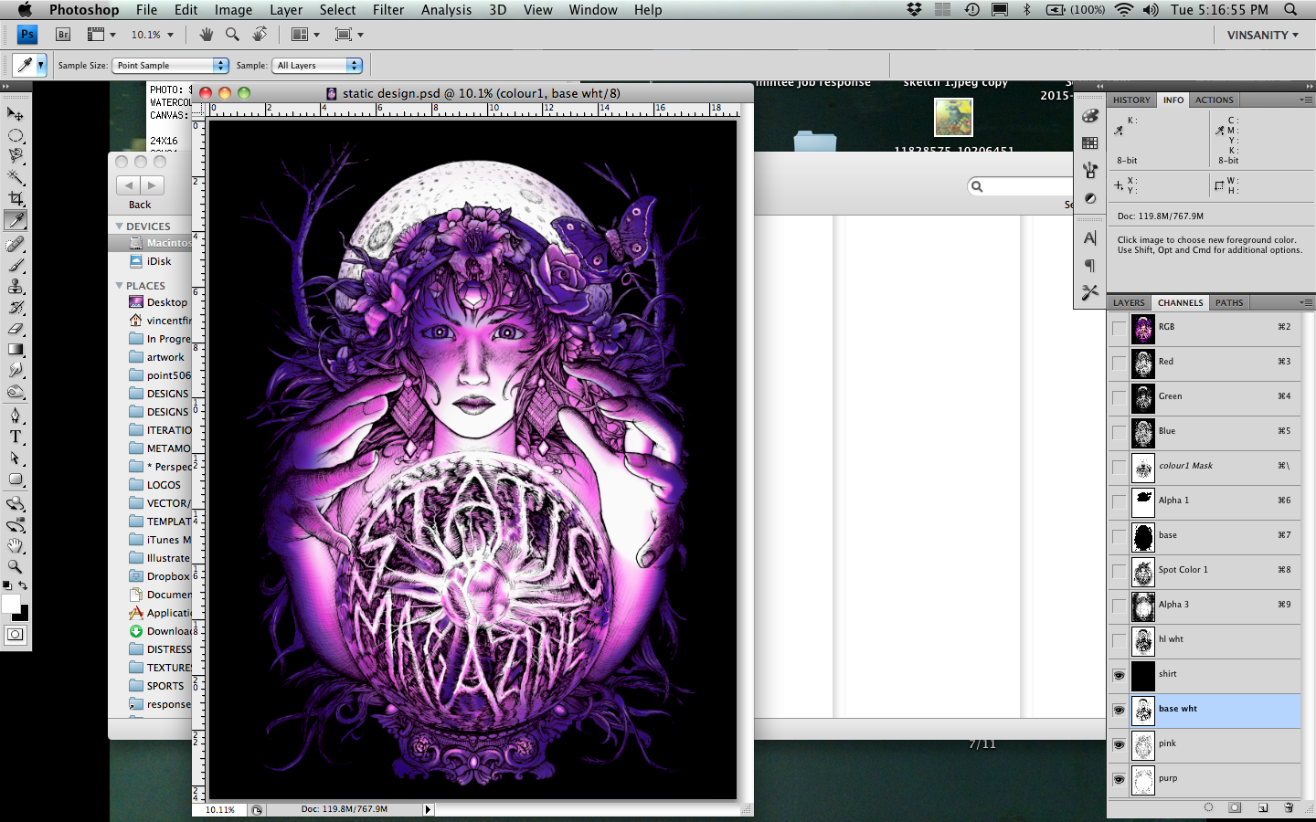
Notice the final plate looks like it added nothing really, but it did. My 4 color separations for this image were as follows:
1. Base white/discharge
2. Magenta
3. Bluish Purple
4. Highlight White (to make sure those white areas really POP!)